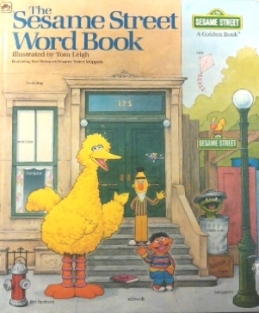
The original version of the very fun “Sesame Street Word Book.”
I’ve mentioned in the past that I’m a big fan of old-school Sesame Street books. And, by “old school”, I’m typically talking about the pre-Elmo era. Maybe it’s just nostalgia, but Sesame Street always felt so much more engaging to me when the street was a little grimy and urban (it looks so gentrified now), when Jim Henson and Frank Oz were stationed beneath Ernie and Bert, and when you could always find an afro or two sitting at the counter at Mr. Hooper’s store. One of my favorite Sesame Street books from this era is The Sesame Street Word Book, illustrated by Tom Leigh, a tremendous illustrator with a wide body of Sesame Street projects on his resume.
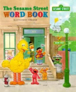
However, there are TWO versions of The Sesame Street Word Book out there – the original 1983 edition and a re-issued 1998 edition – and one is CLEARLY superior to the other. Let me give you a quick overview of the book itself and then I’ll let you know which one to embrace and which to avoid.

The revised edition of the “Sesame Street Word Book”. Can you spot the differences? HINT: Elmo…)
If you’ve never seen it before, The Sesame Street Word Book is probably the closest thing I’ve ever found to a Sesame Street version of a Richard Scarry book. My daughter adores all of those over-sized Scarry books like the Best Word Book Ever, What Do People Do All Day?, and Cars and Trucks and Things That Go – those big, uber-detailed landscape spreads packed with scenes of city life, a huge cast of characters, and absolutely everything labeled. They make great road trip books and they’re the kinds of books that a kid can get lost in for an entire afternoon.
As I mentioned, The Sesame Street Word Book follows the Richard Scarry model pretty closely, offering a variety of scenes featuring Sesame Street characters where we learn about a big swath of topics, everything from feelings and shapes to what we can expect to find in a doctor’s office or in a supermarket.
The book opens with a great “Note to Parents” from the Children’s Television Workshop, which tells us: “The Sesame Street Word Book provides children with a rich and colorful environment in which to explore the world of words. Entertaining scenes introduce more than 1000 words in context to help children’s expand and organize their vocabulary. Detailed pictures with easy-to-read labels demonstrate that words are symbols – for actions, people, places, and things.”
That’s probably one of the best definitions of a “word book” that I’ve ever heard. We had a lot of word books in rotation in my daughter’s room when she was very young, but, as she got older, she became less and less interested in them. Many word books come across as just illustrated dictionaries and, once my daughter learned all of the terminology for kitchen utensils or farm animals, she very quickly lost interest with most of the word books in our library. It’s a testament to the quality and depth of books like The Sesame Street Word Book and the works of Richard Scarry that I still occasionally find my daughter flipping through them on rainy days.

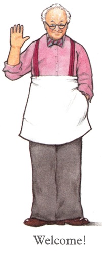
I miss Mr. Hooper…
While Tom Leigh doesn’t have Richard Scarry‘s virtuoso talent (who does?), he is an incredibly skilled artist and the level of detail and character he packs into The Sesame Street Word Book is amazing. With the possible exception of Michael Smollin (illustrator of The Monster at the End of this Book), I consider Leigh to be the definitive Sesame Street illustrator of all time (which is saying something when you realize how many Sesame Street books have been published over the years).
But, as I mentioned at the start, Leigh produced TWO different versions of The Sesame Street Word Book – the original 1983 version and a re-issued version in 1998. And, as you may be able to guess from the introduction to this article, I greatly prefer the original version. But that’s not just my old-school Sesame nostalgia talking. The fact is – the 1983 Sesame Street Word Book is a much longer, deeper, and all-around better piece of work. While you can sometimes find descriptions online of the 1998 version adding “additional art,” the truth is that the 1998 revision cuts out almost a third of the original book for no real discernable reason. [read the rest of the post…]
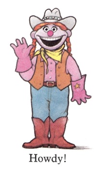 Question: What’s cuter than a semi-obscure Sesame Street character saying “Hello”? Answer: Nothing. Have a great rest of the day, Rodeo Rosie.
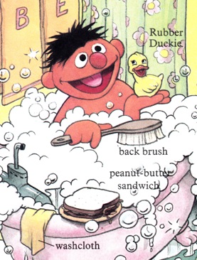 There is a recurring visual joke that runs throughout a lot of Sesame Street books in which the perpetually bathing Ernie is always pictured with a sandwich that he has apparently brought into the bathroom with him. (It shows up pretty often in the 1980s Sesame Street Book Club books.) This is both hilarious and really, really gross. [read the rest of the post…]