Art & Max by David Wiesner

Take a look at how David Wiesner got started on “Art & Max”

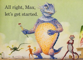
Here’s a very cool video with David Wiesner, creator of Art & Max, one of my favorite picture books about art, talking about the origins of the book and how playing with different art media inspired his lovely, lizard-filled story about the creative process. The video not only offers up some interesting insights into how Wiesner works, but it also shows you some of the earliest images that Wiesner created during the book’s evolution. (Fun fact – In the early stages, Art was a bear, not a lizard.)

{ 0 comments }

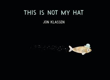
The American Library Association announced the winners of their major 2013 book awards on Monday, and the award that always catches my attention is the Caldecott Medal, named in honor of nineteenth-century illustrator Randolph Caldecott. The award is presented to “the artist of the most distinguished American picture book for children” from the past year, and former winners include such Building a Library favorites as A Ball for Daisy by Chris Raschka, A Sick Day for Amos McGee by Erin and Philip Stead, Flotsam by David Wiesner, and many, many more. This year, the 2013 Caldecott Medal was awarded to This Is Not My Hat by Jon Klassen.

This Is Not My Hat by Jon Klassen

That fish totally stole that hat and now he’s being rewarded?

I couldn’t be happier about this selection. I wrote a glowing review of Klassen’s I Want My Hat Back last year, and This Is Not My Hat continues the hat-swapping fun. It’s a hysterical read and absolutely gorgeous to look at. The ALA also named five Caldecott Honor Books for 2013Creepy Carrots!, illustrated by Peter Brown (artist of the great The Purple Kangaroo and Children Make Terrible Pets), written by Aaron Reynolds; Extra Yarn, illustrated by Jon Klassen (winning a Medal and an Honor Citation.. nice), written by Mac Barnett (author of the hilarious Chloe and the Lion); Green by Laura Vaccaro Seeger; One Cool Friend, illustrated by David Small (creator of one of our favorite books ever, Imogene’s Antlers), written by Toni Buzzeo; and Sleep Like a Tiger, illustrated by Pamela Zagarenski, written by Mary Logue.

We’ve read This Is Not My Hat, Creepy Carrots!, and Extra Yarn so far and definitely recommend them. We’re hoping to snag the rest soon, but I’m sure that, following the award announcements, their library hold lists exploded. BUT, if you’d like to sample this year’s Caldecott books before you get in line at the library, I put together this collection of book trailers and videos for all of the 2013 Caldecott honorees. First up, let’s take a look at the book trailer for the 2013 Caldecott Medal winner This Is Not My Hat.

Next, Peter Brown talks about how The Twilight Zone inspired his artwork for Creepy Carrots.

This fan-produced book trailer for Extra Yarn gives you a very cool, very thorough look at Jon Klassen’s fantastic artwork. [read the rest of the post…]

{ 2 comments }

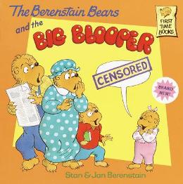
The Berenstain Bears and the Big Blooper

If Sister Bear can be fallible, can’t we all?

I write a lot about the joys of reading aloud to your kid. This is a cautionary tale about what happens when reading aloud goes wrong.

Before we begin, for the record, I am a fan of The Berenstain Bears. While I know some parents who find their books to be provincial and occasionally preachy, I think, for the most part, Stan and Jan Berenstain are extremely skilled at crafting very engaging and accessible stories for early readers. (I should note that I, personally, very much prefer the earlier Berenstain Bear books – Old Hat, New Hat; The Berenstain Bears’ Science Fair; The Berenstain Bears and the Sitter, etc – to the newer editions that Jan co-wrote with their son Michael.)

The Berenstain Bears series was the first example of series fiction that my daughter really fell in love with, and I think that’s a pretty common occurrence. Many parents are comfortable buying their young children Berenstain Bears books for a variety of reasons – the stories are well told, the art is consistent, the books are inexpensive, the characters are captivating, the quality of the storytelling greatly outshines the other books on that one spinning rack at the bookstore (normally, cheap Barbie or princess books) – the list goes on and on. Berenstain Bears books have become a foundational pillar of modern children’s literature because they’ve created this very warm, very safe place for young readers to return to again and again.

Which was why I was so surprised when a Berenstain Bear book made me say the F-word in front of my daughter.

LET ME EXPLAIN…

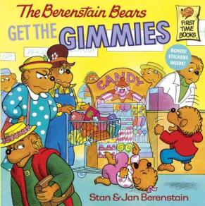
The Berenstain Bears Get the Gimmies

It looks SO innocent on its cover, doesn’t it?

OK, in reality, the incident was maybe 90% my fault, 10% the book’s fault (maybe more like 70/30). The book in question was The Berenstain Bears Get the Gimmies, a fun little tale of Brother and Sister Bear learning not to expect toys, candy, and presents every time they go out to the store. It’s a book designed to tell children not to lose their minds in front of the candy rack at the supermarket checkout, so I fully support Stan and Jan‘s intentions behind writing the book. It has a great lesson at its core. HOWEVER, it also features a tongue-twister that completely got the better of me one night at bedtime. [read the rest of the post…]

{ 3 comments }

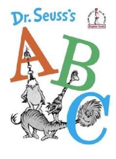
Dr. Seuss' ABC

A, B, and then C? SO predictable…

While I’d like to think that any good book is timeless, there are certain kinds of books that you end up buying for your children that do seem to come with a very implicit “best if used by” date stamped on their side. For example, I know many children who, once they reached a certain age, refused to read board books anymore. To them, board books = baby books. And, regardless of the book itself (we have board book versions of older-skewing books like Olivia and Madeline), some six-year-olds just won’t be seen dead reading a board book. Another example of a kind of kid’s book that comes with a very distinct shelf-life is the Alphabet Book.

Alphabet books are possibly one of the most common kinds of picture books you can find for younger pre-readers. Their mission is simple and true – reinforcing kids’ knowledge of the alphabet from A to Z. This can be accomplished through pictures, rhyming couplets, you name it. Start at A, end at Z – they come with their own structure built in. No wonder there are so many alphabet books on the market. However, what happens to the book once a kid learns their alphabet backwards and forwards?

Unlike storybooks, alphabet books can be fairly utilitarian. They normally don’t feature stories, characters, or emotions for children to encounter and revisit. Most alphabet books just want to make sure that kids know that J comes before K and, once that’s accomplished, it’s O.K. (letters 15 and 11, respectively) to put them aside. However, there are classes of alphabet books and some are much more expertly executed than others. Some alphabet books transcend mere letter instruction and can stand on their own two feet much longer than their more cheaply produced brethren.

So, if you’re looking for a good alphabet book and you’ll like it to have a longer shelf-life than the crappy paperback A-to-Z book that came with your Happy Meal, here are six really great examples of alphabet books that do a whole lot more than just teach kids about letters.

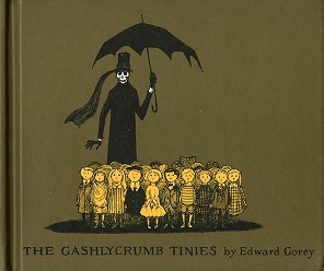
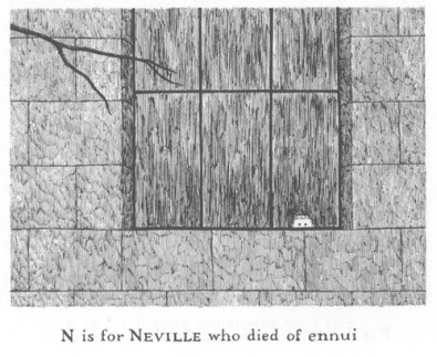
1. The Gashlycrumb Tinies by Edward Gorey

The Ghastlycrumb Tinies by Edward Gorey

Simply a classic.

Let’s get this out of the way right at the top – the greatest alphabet book of ALL TIME is Edward Gorey‘s The Gashlycrumb Tinies.

Granted, it’s more of a commentary on alphabet books than anything, but it is one of the most brilliant, oddball, most often-copied books I’ve ever read. (Fair warning – there are a LOT of lame “parodies” of The Gashlycrumb Tinies out there.) But it is dark. And it is macabre. It is really, really macabre. And if your kid is into that, they might LOVE it. Personally, I know my daughter is far too easily creeped out to really enjoy a line like “X is for Xerses devoured by mice” without it giving her nightmares for a week. In regards to your own kid, you can read the whole book online here and decide for yourself. But, even though I can’t imagine ever giving The Gashlycrumb Tinies to a still-learning-to-read three-year-old, there is such genius and humor in Gorey’s work that it’d be a shame to keep this alphabet book away from kids entirely. As such, there’s a copy of The Gashlycrumb Tinies sitting on our “Books My Kid Will Read in the Future” shelf that’ll be waiting for my daughter whenever I think she’s ready for it.

The Ghastlycrumb Tinies by Edward Gorey

Hands down, the greatest literary death of all time.

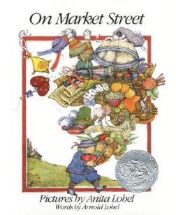
2. On Market Street by Arnold Lobel, illustrated by Anita Lobel

On Market Street

Using capitalism to teach kids the alphabet…genius.

I’ve known about Arnold Lobel since I was a kid thanks to his classic Frog and Toad books, but I’ll admit that On Market Street, a truly wonderful alphabet book, was my first introduction to the work of his wife, Anita Lobel, a hugely talented children’s book creator in her own right. On Market Street is one of those rare picture books that you’ll find your kids revisiting again and again, if only to re-appreciate and re-explore the depth and complexity of the artwork. The premise is relatively simple – a young child heads down Market Street “to see what I might buy”. The Lobels then lead us past an A-to-Z series of wildly imaginative merchants who all have bodies constructed out of whatever it is they’re selling. Thus, the apple vendor is made entirely out of apples, the book seller is made entirely out of books, etc. [read the rest of the post…]

{ 13 comments }

I wrote a lot of words about a word book yesterday, which seems appropriate, but, to be honest, reading the 1983 edition of The Sesame Street Word Book is a primarily a visual experience. It’s telling that there isn’t an author listed for the book – the only credit on the cover is “illustrated by Tom Leigh.” Because, while it is great that The Sesame Street Word Book teaches us obscure terms like “pancake turner”, “otoscope,” and “hod carrier”, the real fun of the book lies in Leigh’s illustrations. So, in an attempt to convey just what an entertaining book this is to flip through, here are my personal picks for my fifteen favorite illustrations from The Sesame Street Word Book.

Some of these are sweet, some are funny. Some are unintentionally funny. Some are only funny because they remind you that, yes, this book was indeed published in 1983. But, regardless, they all just make me love this book all the more.

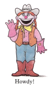
1. Hello!

Sesame Street Word Book - Rodeo RosieQuestion: What’s cuter than a semi-obscure Sesame Street character saying “Hello”? Answer: Nothing. Have a great rest of the day, Rodeo Rosie.

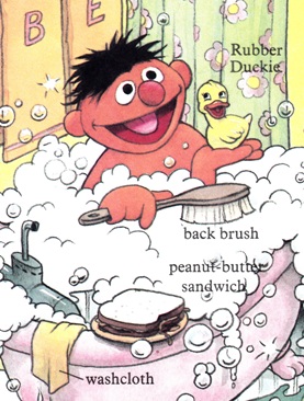
2. Bathroom Sandwich

Sesame Street Word Book - ErnieThere is a recurring visual joke that runs throughout a lot of Sesame Street books in which the perpetually bathing Ernie is always pictured with a sandwich that he has apparently brought into the bathroom with him. (It shows up pretty often in the 1980s Sesame Street Book Club books.) This is both hilarious and really, really gross. [read the rest of the post…]

{ 3 comments }

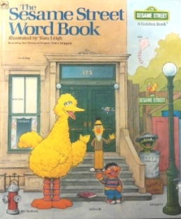
The Sesame Street Word Book (1983)

The original version of the very fun “Sesame Street Word Book.”

I’ve mentioned in the past that I’m a big fan of old-school Sesame Street books. And, by “old school”, I’m typically talking about the pre-Elmo era. Maybe it’s just nostalgia, but Sesame Street always felt so much more engaging to me when the street was a little grimy and urban (it looks so gentrified now), when Jim Henson and Frank Oz were stationed beneath Ernie and Bert, and when you could always find an afro or two sitting at the counter at Mr. Hooper’s store. One of my favorite Sesame Street books from this era is The Sesame Street Word Book, illustrated by Tom Leigh, a tremendous illustrator with a wide body of Sesame Street projects on his resume.

However, there are TWO versions of The Sesame Street Word Book out there – the original 1983 edition and a re-issued 1998 edition – and one is CLEARLY superior to the other. Let me give you a quick overview of the book itself and then I’ll let you know which one to embrace and which to avoid.

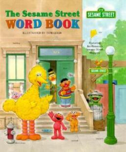
The Sesame Street Word Book (1998)

The revised edition of the “Sesame Street Word Book”. Can you spot the differences? HINT: Elmo…)

If you’ve never seen it before, The Sesame Street Word Book is probably the closest thing I’ve ever found to a Sesame Street version of a Richard Scarry book. My daughter adores all of those over-sized Scarry books like the Best Word Book Ever, What Do People Do All Day?, and Cars and Trucks and Things That Go – those big, uber-detailed landscape spreads packed with scenes of city life, a huge cast of characters, and absolutely everything labeled. They make great road trip books and they’re the kinds of books that a kid can get lost in for an entire afternoon.

As I mentioned, The Sesame Street Word Book follows the Richard Scarry model pretty closely, offering a variety of scenes featuring Sesame Street characters where we learn about a big swath of topics, everything from feelings and shapes to what we can expect to find in a doctor’s office or in a supermarket.

The book opens with a great “Note to Parents” from the Children’s Television Workshop, which tells us: “The Sesame Street Word Book provides children with a rich and colorful environment in which to explore the world of words. Entertaining scenes introduce more than 1000 words in context to help children’s expand and organize their vocabulary. Detailed pictures with easy-to-read labels demonstrate that words are symbols – for actions, people, places, and things.”

That’s probably one of the best definitions of a “word book” that I’ve ever heard. We had a lot of word books in rotation in my daughter’s room when she was very young, but, as she got older, she became less and less interested in them. Many word books come across as just illustrated dictionaries and, once my daughter learned all of the terminology for kitchen utensils or farm animals, she very quickly lost interest with most of the word books in our library. It’s a testament to the quality and depth of books like The Sesame Street Word Book and the works of Richard Scarry that I still occasionally find my daughter flipping through them on rainy days.

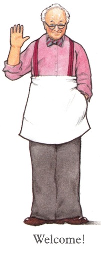
The Sesame Street Word Book (1983) - Mr. Hooper

I miss Mr. Hooper…

While Tom Leigh doesn’t have Richard Scarry‘s virtuoso talent (who does?), he is an incredibly skilled artist and the level of detail and character he packs into The Sesame Street Word Book is amazing. With the possible exception of Michael Smollin (illustrator of The Monster at the End of this Book), I consider Leigh to be the definitive Sesame Street illustrator of all time (which is saying something when you realize how many Sesame Street books have been published over the years).

But, as I mentioned at the start, Leigh produced TWO different versions of The Sesame Street Word Book – the original 1983 version and a re-issued version in 1998. And, as you may be able to guess from the introduction to this article, I greatly prefer the original version. But that’s not just my old-school Sesame nostalgia talking. The fact is – the 1983 Sesame Street Word Book is a much longer, deeper, and all-around better piece of work. While you can sometimes find descriptions online of the 1998 version adding “additional art,” the truth is that the 1998 revision cuts out almost a third of the original book for no real discernable reason. [read the rest of the post…]

{ 2 comments }

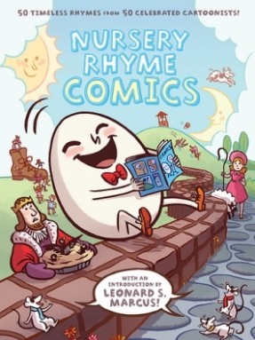
Nursery Rhyme Comics

This book could not be more popular in our household…

Back in May, I wrote a positively glowing review of Nursery Rhyme Comics, a 2011 collection of “50 timeless rhymes from 50 celebrated cartoonists” that my daughter instantly adored. Seriously. She LOVED IT. It became the book my daughter talked about endlessly, the book that she wanted to check out every single time we visited the library.

To give you a full picture of her unbridled affection for Nursery Rhyme Comics, here’s a telling excerpt from my original review:

Do you want to know how much [my daughter] loved it? The next day, after I had to read her the whole anthology AGAIN, she asked me, “Do you think Santa will bring me this book for Christmas if I ask him?” For those of you without kids, just FYI, that’s maybe the single greatest endorsement ANY kids’ book can EVER have. That’s like a movie winning 12 Oscars and making a billion dollars at the box office.

That’s right. She asked for it from SANTA. That’s a big deal for a kid. And that happened back in May and, right before Christmas, my daughter asked me again – she remembered – and she asked, “Do you think Santa is going to bring me my own copy of Nursery Rhyme Comics?”

C’mon, parents, how could Santa say no to that? With that in mind, I present this quick video of our 2012 Christmas morning. (The “He” my daughter keeps referring to in the video is, of course, Santa.) So, thanks, First Second Books and Chris Duffy (editor of Nursery Rhyme Comics), as you can see, you guys – and St. Nick – really made my daughter’s Christmas.

{ 0 comments }

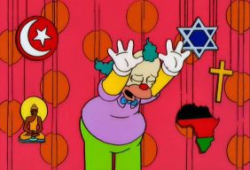
Happy Holidays from Krusty the Clown

It’s always good to remember the reason for the season – our sponsors.

I’m never sure what holidays people celebrate, so, at this time of the year, I always swipe a line from my personal favorite spiritual leader, Krusty the Clown, and declare, “Have a Merry Christmas, Happy Chanukah, Kwazy Kwanza, a Tip-Top Tet, and a solemn, dignified Ramadan.” And, if I missed your preferred celebration, I truly do apologize. As 2012 grinds down to halt, I mostly just hope that all parents, kids, and everyone in between are healthy, happy, and have some great reading material at their disposal.

And, if you are celebrating Christmas today, I hope your morning is more like this:

And less like this:

Happy Holidays!

{ 0 comments }

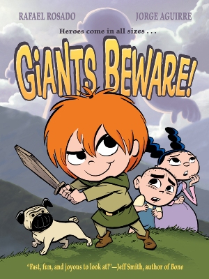
Giants Beware

Q: Who would in a showdown – Claudette or Merida from “Brave”? A: The audience.

First Second Books published Giants Beware!, our favorite kid’s book of 2012, and no one can fault them for failing to create some great promotional material for Jorge Aguirre and Rafael Rosado‘s sublime graphic novel. I mentioned the book’s great downloadable activity kit in my review, but First Second also created two very cool book trailers for Giants Beware as well.

The first trailer is a dynamic movie trailer-esque preview of the book – the video is a montage of music and images that really sells how Claudette’s adventures read like a blockbuster animated movie.

The second trailer is interesting. It’s less of a trailer and more of a look behind the scenes at the creation of the book. Basically, it’s a three-and-a-half minute, real-time video of Rafael Rosado digitally inking a page from Giants Beware. There’s no commentary or narration, just some accompanying music as we look over Rosado’s shoulder while he works. While there’s a part of me that really would’ve enjoyed hearing Rosado talk more about his creative process, I found myself really sucked in by the video and this look into his studio. (You will either find this video fascinating or dead boring – fair warning.) Enjoy.

{ 0 comments }

Giants Beware

A truly superior graphic novel for kids

My daughter and I have read a lot of books together this year. A LOT. But, as the year winds down and I find myself looking back at our favorite books of 2012 – the instant classics, the bedtime staples, the required road-trip reading – I keep coming back to Giants Beware!, a fantastic, tour de force graphic novel by Jorge Aguirre and Rafael Rosado, which stands as one of the best examples of comics for kids that I’ve ever read.

And, because due diligence is important, I did check with my daughter before bedtime last night and she did authorize me to, quote-unquote, “tell your blog, Dad, that Giants Beware is my favorite new book I read this year.” So, it’s unanimous – Giants Beware is Building a Library’s Best Book of 2012.

What’s so great about Giants Beware? It’s hard to know where to start. I’ve been trying to review it for most of the year, but there are times when I like a book so much that I almost find it impossible to write about it. I find myself tripping over my words, unable to express how much I enjoy the book in question, until I’m halfway tempted to just type “Book am good. Make me happy” and be done with it. But Giants Beware does so much right, it deserves better and, thus, here we are.

With Giants Beware, Aguirre and Rosado have created a blockbuster reading experience. What I mean by that is – this graphic novel is so smart, exciting, accessible, and entertaining that, if it was a movie, it would make $500 million dollars at the box office. The experience of reading Giants Beware is akin to watching a Pixar movie. (One of the best ones.) You just sit there amazed at being told a story with such obvious genius and craftsmanship and also at how you and your child are both able to appreciate it on multiple levels.

That is all to say, I really, really like Giants Beware and so does my kid.

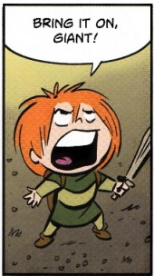
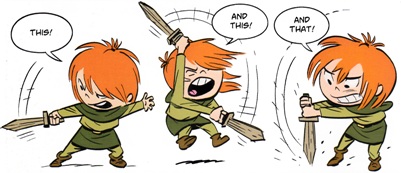
The story revolves around Claudette, a headstrong tomboy who’s always clutching a wooden sword and who can’t wait to one day leave her provincial village and prove herself as a mighty giant slayer. Her father, the town blacksmith, used to be a renowned adventurer (and is now missing a few limbs due to those adventures), and Claudette is aching to follow in his phantom footsteps. She especially wants to set off on a quest to a local mountain range to hunt down a legendary local giant with a reputation for eating babies’ feet. (Aguirre and Rosado are able to make the alleged baby-feet-eating into something that’s really funny as opposed to downright chilling.)
Giants Beware

Don’t cross Claudette if you know what’s good for you…

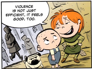
Claudette is just a fantastic creation – she’s so singularly obsessed with killing monsters that she can barely see anything else in the world. She’s funny, clever, earnest, and loyal – her loyalty particularly shines through when it comes to her best friend Marie and her little brother Gaston. (One of my favorite Claudette lines comes after she dispatches some bullies who were picking on Gaston – “Violence is not just efficient. It feels good, too.”)
Giants Beware

Words to live by…

However, Claudette is so obsessed with slaying the feet-eating giant that she tricks Marie and Gaston into accompanying her on a giant-slaying quest – a quest that was expressly forbidden by both her father and the town’s ruling Marquis (who happens to be Marie’s father). As the kids set off across the countryside towards their date with a giant, pursued doggedly by their annoyed parents, they encounter witches, haunted trees, mad river kings, and a wide variety of fairy tale oddities, experiences that help them test their meddle, conquer their fears, and learn a lot more about the strange world around them.

Giants Beware is a very fun read that really connected with my daughter. It’s a longer graphic novel – around 200 pages – but, the first time I finished reading it to her, my daughter asked me to immediately re-read it, which has never happened before. But the re-read factor isn’t the only reason why I regard this as our favorite book of 2012. While, I’ll admit, there were books we read this year that packed a deeper emotional punch (a tear-jerker, this ain’t), Giants Beware is just an exceptionally accomplished piece of work, a work that shouldn’t be trivialized just because you could accurately describe it as “a fun adventure.”
Giants Beware

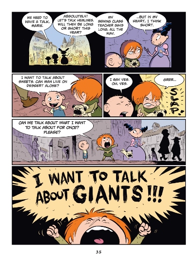
This is a seriously funny and beautiful book…

And, personally, one of the main reasons why I think I’ve responded to Giants Beware so strongly is that it expertly plays with so many of the children’s literature themes and tropes that I keep obsessing about on this blog (to the point where it almost feels like it crawled out of my subconscious at times). For example, let me list FIVE areas where I think Giants Beware really, really excels:

1. It’s an Ideal Comic Book for Kids

Recurring readers know that I’m a big proponent of exposing kids to comic books and graphic novels, but, as I’ve complained about before, most comic books aren’t designed in a way to make them accessible to developing readers. The vast majority of so-called “kid’s comics” have miniscule font sizes, hectic layouts, and little-to-no concern with helping new readers follow their way throughout the story. Giants Beware, on the other hand, excels at making itself both accessible and appealing to younger readers. The text is extremely readable, the layouts are clean and clear, and the visual storytelling is top-notch. Even though it’s 200 pages long, Giants Beware is a very quick, readable work for kids. I’d almost equate it to a beginning chapter book, along the lines of a Mercy Watson book, and there just aren’t that many kid’s graphic novels out there that pay such careful attention to the needs of new readers. [read the rest of the post…]
{ 3 comments }